How do I tone down the yellow in my floors?

Quick Tips for Toning Down Yellow
I come across this question often in design group discussions and when working with clients. Sometimes it’s flooring, sometimes it’s cabinets, but the angst is the same: am I going to have to replace these big ticket items? Short answer: maybe not. Before you start demo, try these 3 color theory strategies.
Change Your Bulbs — Start Here!
Experimenting with bulbs is the easiest, least expensive strategy for shifting the hue of your home. Specifically, you want to know what color temperature (measured in Kelvins (K)) you’re working with. If you noticed your primary lighting source bulbs are 2700K and your goal is to make your flooring, cabinets, wall color or other main component look less yellow, then try 3000K or 3500K bulbs. As a personal preference, I rarely go above 4000K in a residential setting to maintain a sense of warmth and coziness.

Warm Your Walls
This one trips people up: if you want your yellow flooring/cabinets/etc to fade into the background, paint your walls a warm, neutral color. Cooler wall colors will create contrast, making both stand out more.
A few of my favoritewarm neutrals to pair with yellow floors/cabinets (sample in your space before committing!):
SW Shoji White
SW Natural Linen
SW Accessible Beige (if you have sufficient nautral light)
Story time — my first home had yellow/orange travertine floors throughout. Replacing them was not in the budget, so I looked to my wall paint to help “balance out” the yellow. I chose a cool grey paint with purple undertones — about as far across the color wheel from yellow as I could get — and spent nearly a month painting every room in my house.
It was awful.
The yellow in the floors amplified the purple undertones of the paint and vice versa. The contrast made both look worse. It took a couple of months (and a simultaneous moment of courage) for my husband and I to admit we were living in pastel, candy hell. We repainted every wall a warm-greige and were much happier.
Include Yellow in Your Color Palette
In the same vein of “working with” instead of “fighting against” your yellow, choose a color palette that you love that contains yellow. Helpfully, golds are making a comeback (if not already back) and can act as a bridge between yellow and many fresh color palettes that you might love. Mindfully incorporating the yellow instead of attempting to ignore it is going to put it in its place instead of making it stick out like a sore thumb.
Here are a few:

TL;DR Design: Mustard and Neutrals Color Palette
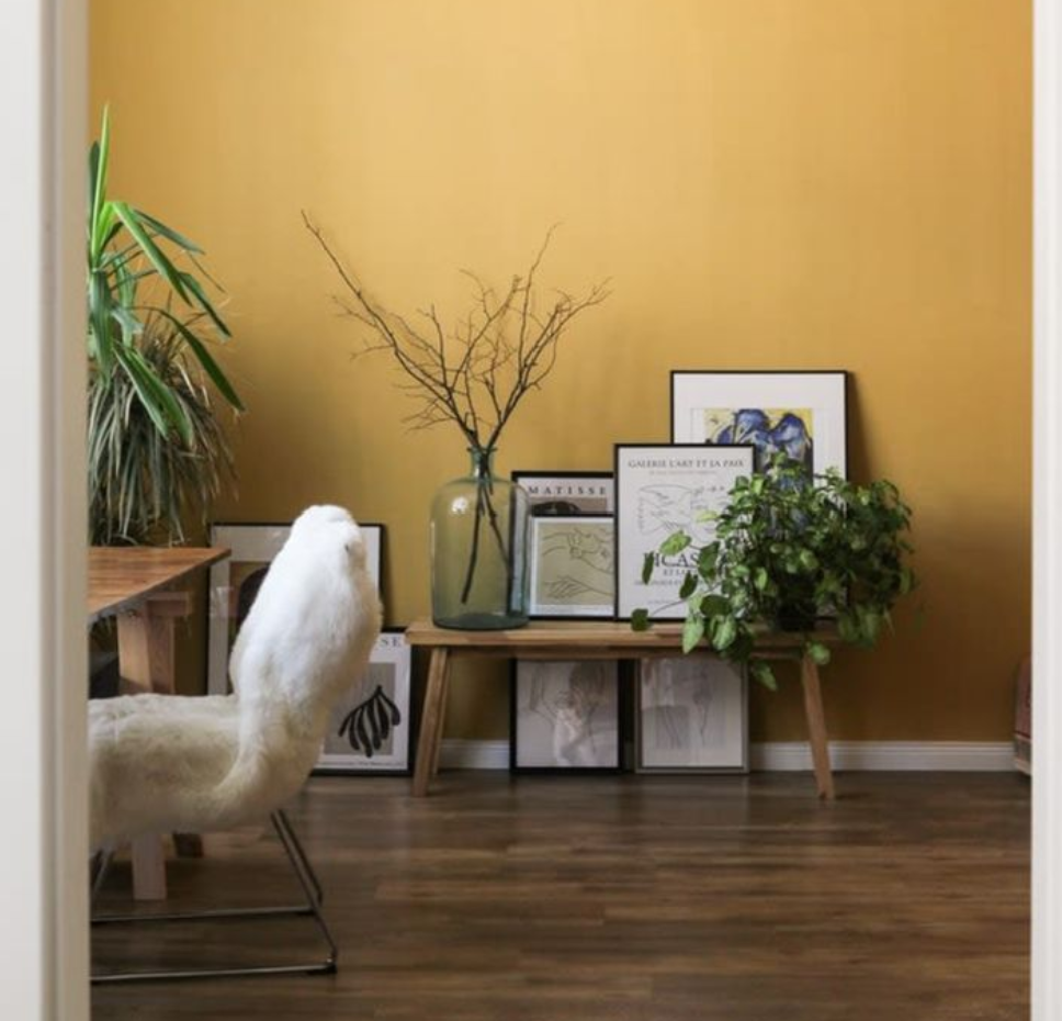
In this room from Kunitsa Home, the yellow is the star of the show with neutrals playing a supporting role.

TL;DR Design: Navy and Yellow Color Palette
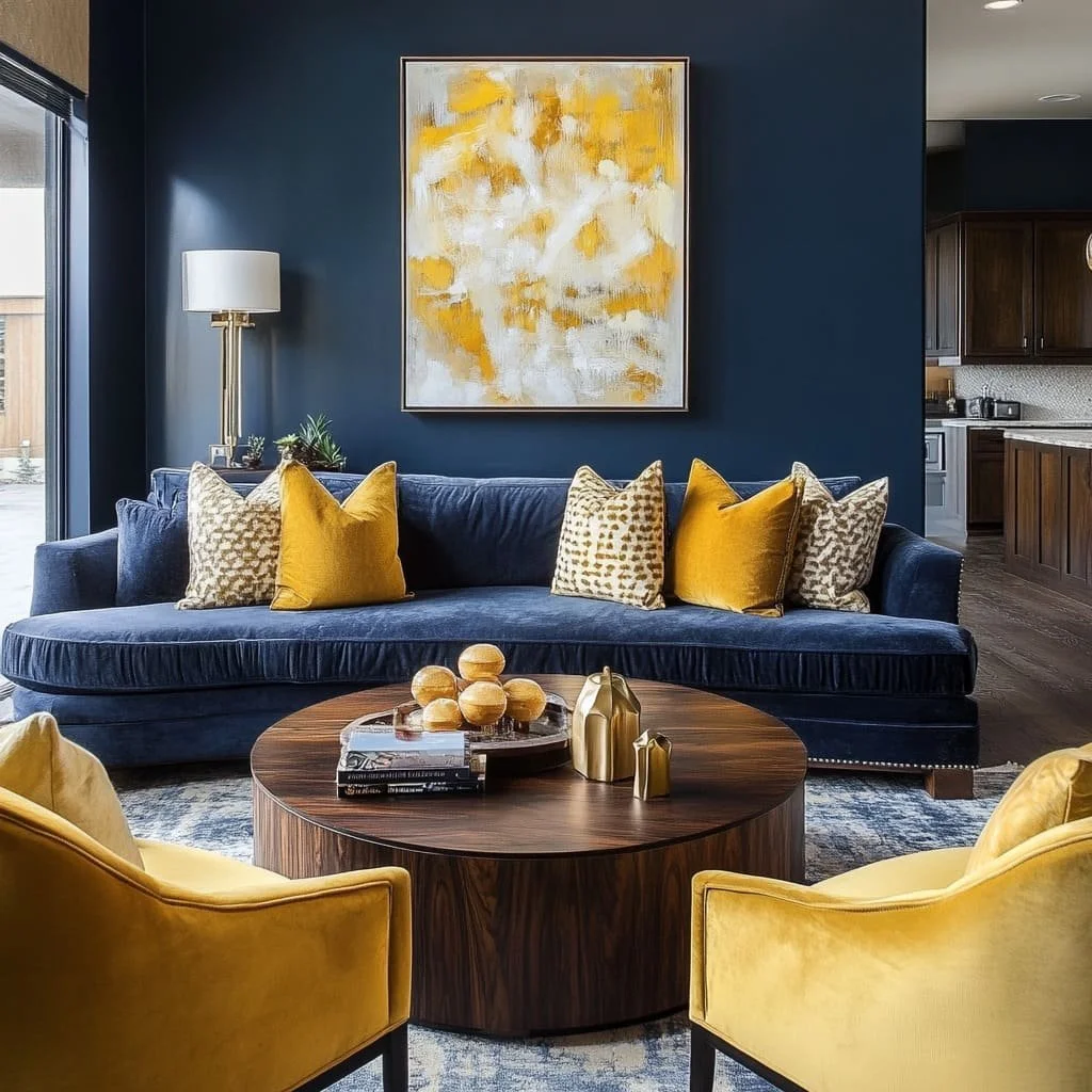
In the navy and yellow room pictured above from Fancy House Design, the contrast between the yellow and blue is intentional and makes the room feel alive.

TL;DR Design: Neutral Oak Kitchen

A litte more subtle, this warm kitchen design from Jake Arnold Design features pale oak cabinets, supported with warm white walls and warm countertops.
Reach Out
Yellow can be tricky, but if you try to incorporate it into your overall design, you might just love it.
I can help you put together a personalized color palette for your home. Drop me a line.