Room Missing Something? Try This!
“TL;DR — Add visual interest to boring rooms by layering patterns, varying color temperatures, or color intensity. Do the opposite to make scattered rooms look more cohesive.”
If you look at your room and think “this needs something,” then try adding more visual contrast. Contrast can be created by incorporating textures, varying scale, and a whole slew of other things. But some of the easiest factors to play with are color and pattern.
Add a Pattern
When I decorated my first home, I avoided patterns. Now, when I get the sense that something is missing, I seek them out. Throw pillows are one of the easiest and least expensive ways to add pattern to a room, followed by area rugs. The larger the scale of the pattern, the more impact it will have. Smaller patterns tend to turn into texture and recede more into the background.
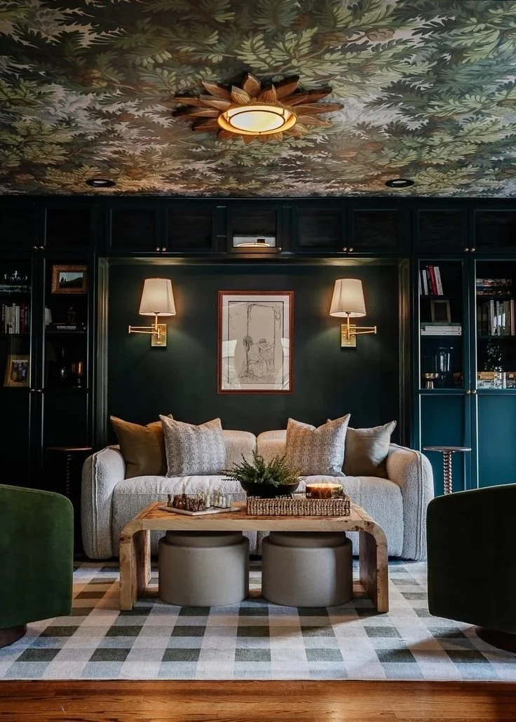
Incorporating multiple patterns is possible, and in many cases, encouraged. A good rule of thumb is to keep hues consistent and vary scale. See the room from Blesser House, below. They go from large- to small-scale patterns starting at the rug, to the ceiling, to the pillows. The similar green hues create unity. This room would still be beautiful with a white ceiling and a beige run, but the patterns give it a polished, professional look.
Play with color temperature
If you’re working with primarily cool hues and want to add visual interest, add a piece with warm hues or vice versa. The example below from Emily Henderson shows a burnt orange couch against a cooler teal wall, making both of them “pop” - because of the contrasting temperatures, the couch looks warmer and the paint looks cooler. Add a few teal throw pillows and a warm tapestry to tie them together, and a focal point is born.
Or conversely, if you’re feeling that a piece of furniture just doesn’t “fit,” it might be competing unsuccessfully against your wall paint. Look to fabric in the form of throw pillows, rugs, tapestries, curtains, and wallpaper to help tie them together. If your wall paint is warm and your couch is cool, choosing warmer throw pillows could help create visual unity.
Color temperature can be deceptively tricky; check out this article to dig deeper.

Experiment with color intensity
You’ve heard designers recommend introducing a “pop of color.” Pushing that one step further, consider playing with color intensity. By selecting furniture and wall color at various intensities within a single color hue, you’re likely to strike a balance between cohesion and visual interest.
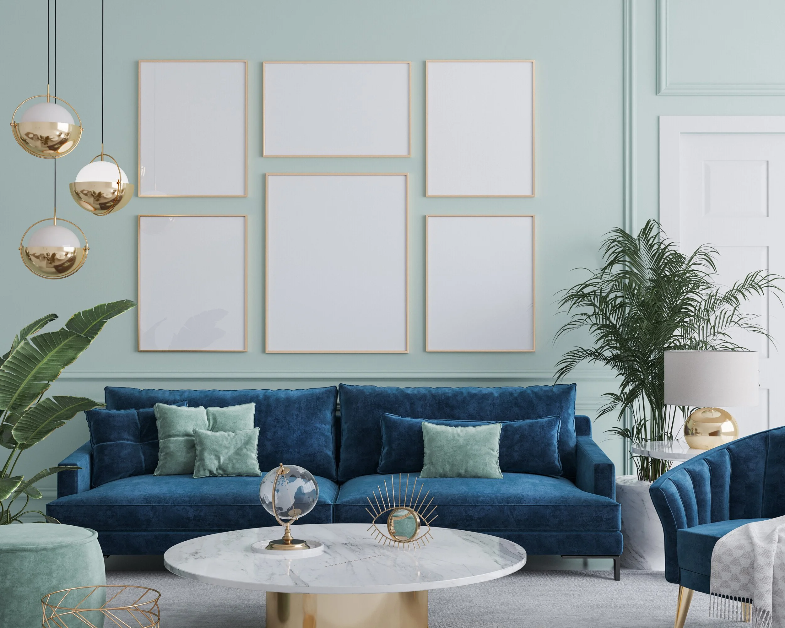
I love this unexpected, fun blue room from Decoraid. Here, the robins egg blue acts as a neutral background for the more intense velvet couch. Although a vibrant room, the cohesive blue hues create a sense of calm.
An easy way to do this is to select a paler, neutral and a bolder, accent color from adjacent color strips.
For example, you might try Lighthearted Pink SW 6568 as your neutral and Heartfelt SW 6586 and your accent - check out the image below. I like selecting from adjacent - or even 2 or 3 strips apart - instead of the same strip for more visual interest.

There are many more ways to add visual interest to your room, but playing with pattern, color contrast, and/or color intensity is a great starting point.
Want to talk through your ideas before committing? Don’t hesitate to reach out!